We’re sure you are probably concerned about making your website responsive. If your answer is yes, you’re in the right place.
Do you know there are nearly 10% more mobile users than desktop users? This doesn’t mean you need to create websites only for mobile users. In today’s world, every user needs a website that can work on all devices hinder-free. This is where responsive website design comes to the forefront.
From desktop systems to tablets, it has become a necessity to provide a smooth experience to all users. Not only is it the right marketing approach to increase conversions and raise traffic, but it also ensures your business’s growth.
Read below this article to learn more about the importance of responsive web design and how we at Digital Verse use the right strategy to transform your website.
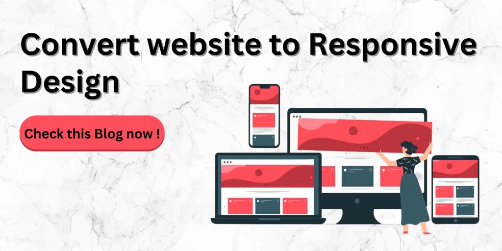
Digital Verse Specializes In Transforming Your Website Into Responsive Designs
Read below to find out how it’s done.
Step 1: Assessment of the website
First, we assess your existing website, understand its current structure and functions, and note down what needs redesigning.
Step 2: We plan an appropriate design.
The team decides how your website will look and adjust to different screens. This is done by optimizing images, texts, and navigations. Work is done on the layout of the website.
Step 3: Modifications to codes
We modify your website’s source code. This is practiced by implementing responsive design technology like media queries and flexible grades.
Step 4: The website undergoes intensive testing.
Before we give a thumbs up to the finalized design, we cross-check the design across various devices to ensure not only its visual appeal to the users but also its smooth functioning.
Step 5: Finalization and seamless deployment
Once the design is checked thoroughly and receives the green signal, we seamlessly deploy the new responsive design to your website.
Top Benefits Of Using Responsive Design For Your Website
There will indeed be uncertainty while accessing a website if it does not appear uniform on the user’s device. This is why responsive designs promise a great user-friendly experience by ensuring uniformity in the display of the website.
It Can Widen Your Audience’s Horizons.
Nearly half of people could be accessing your website through their mobile phones. It is therefore important to ensure that your website not only appears evenly on the laptop but also across phones of varied sizes.
Improves SEO/Search Engine Optimization Ranking
When it comes to website design, you simply can’t overlook the importance of SEO. Google and other search engines favor websites that are responsive, which in turn improves your SEO ranking greatly.
Helps In Maintaining Cost Efficiency
Maintaining a single responsive site is more cost-effective than managing multiple versions of different devices.
Faster Loading Speed
Responsive design promises faster loading times. Your users will have better engagement with the website if the content loading doesn’t take much of their time.
Ensures Future Proofreading
Almost every few weeks, new devices are launched on the market with different screen sizes. Luckily,the responsive website will adapt automatically, so you won’t need to redesign the whole thing completely.
Increase In Conversions And Users
The more convenient, accessible, or responsive your design is, the more users will be attracted, which will lead to increased sales, sign-ups, or other desired actions.
Leading Website Design Company in Hyderabad
After reading the benefits mentioned above, you must be willing to embark on your responsive design journey. Are you left with a lack of clarity? Need a helping hand? Don’t worry, we have got your back. As a premier website design company in Hyderabad and Coimbatore, we are a team of well-experienced, passionate, and skilled website designers and developers who will make this responsive design thing effortlessly stunning for you.
Allow us to weave the magic of responsive design and help you captivate a wider audience.
Conclusion
A step into the realm of website development is incomplete without a strong hold over your website’s responsive design. A top-notch responsive design is the key to attracting numerous satisfied users around the globe. Responsive design is the stage on which all the other elements of your website perform their functions. And if the stage is well set, half of your job is done, right?
Stay tuned for more such informative blog posts by Digital Verse.